先看下最终实现的效果:

首先定义一个
先给外层的容器添加样式:
1
2
3
4
5
6
7
8
9
10
11
12
13
14
15
16
| p.speech
{
position: relative;
width: 200px;
height: 100px;
text-align: center;
line-height: 100px;
background-color: #fff;
border: 8px solid #666;
-webkit-border-radius: 30px;
-moz-border-radius: 30px;
border-radius: 30px;
-webkit-box-shadow: 2px 2px 4px #888;
-moz-box-shadow: 2px 2px 4px #888;
box-shadow: 2px 2px 4px #888;
}
|
没有什么特别复杂的,主要的核心就在postion:relative,用来定位对话浮层的。我们还需要一些Mozilla和webkit的属性来完成圆角和阴影,IE8以下的浏览器看不到这些属性,只是显示一个框,不影响总体的效果。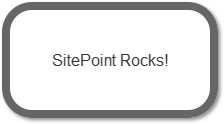
我们现在需要创建对话浮层下面的那个三角形的指向标志了。不使用图片,我们使用CSS边框来完成这个效果。看看下面这个用不同颜色边框完成的效果。

我们把高度和宽度减少到0px,然后给边框使用不同的大小,看看效果:

为了最后能做成指示标志的样子,我们把上边距和左边距设置为solid,下边距和右边距设置为透明:

但是我们把这个放哪呢?还好,我们可以使用CSS的伪类:before和:after来生成,所以:
1
2
3
4
5
6
7
8
9
10
11
| p.speech:before
{
content: ' ';
position: absolute;
width: 0;
height: 0;
left: 30px;
top: 100px;
border: 25px solid;
border-color: #666 transparent transparent #666;
}
|
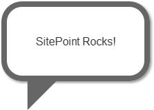
现在三角形的标识就定位在我们的气泡下面了。另外,不要费事去考虑这个元素的阴影,他会定位在透明边界的旁边,而不是看到的图形的旁边。
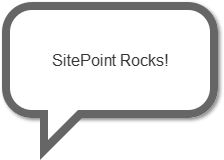
我们还需要移除三角形的一部分。我们可以在里面放置一个白色的小三角形来达到这个效果。
1
2
3
4
5
6
7
8
9
10
11
| p.speech:after
{
content: ' ';
position: absolute;
width: 0;
height: 0;
left: 38px;
top: 100px;
border: 15px solid;
border-color: #fff transparent transparent #fff;
}
|
我们的不使用图片的对话气泡就完成了:
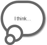
另外,我们还可以使用:before和:after伪类来做很多其他的事情,比如,一个思考气泡也可以通过这样办法完成:
首先也是建一个
1
| <p class="thought">I think...</p>
|
css代码:
1
2
3
4
5
6
7
8
9
10
11
12
13
14
15
16
17
18
19
20
21
22
23
24
25
26
27
28
29
30
31
32
33
34
35
36
37
38
39
40
41
| p.thought{
position: relative;
width: 130px;
height: 100px;
text-align: center;
line-height: 100px;
background-color: #fff;
border: 8px solid #666;
-webkit-border-radius: 58px;
-moz-border-radius: 58px;
border-radius: 58px;
-webkit-box-shadow: 2px 2px 4px #888;
-moz-box-shadow: 2px 2px 4px #888;
box-shadow: 2px 2px 4px #888;
}
p.thought:before, p.thought:after{
content: '';
position: absolute;
left: 10px;
top: 70px;
width: 40px;
height: 40px;
background-color: #fff;
border: 8px solid #666;
-webkit-border-radius: 28px;
-moz-border-radius: 28px;
border-radius: 28px;
z-index:5;
}
p.thought:after{
position: absolute;
width: 20px;
height: 20px;
left: 5px;
top: 100px;
-webkit-border-radius: 18px;
-moz-border-radius: 18px;
border-radius: 18px;
z-index:6;
}
|
最新实现效果: