一、mixin是什么
@mixin是一种简化代码的方法,能够提高代码的重复使用率。
二、mixin的基本用法
mixin定义(使用@mixin定义):
1
2
3
4
5
6
7
8
9
| @mixin hexagon($width, $factor, $border-radius){
display: inline-block;
border-radius: 50%;
width: ($width + $border-radius) * $factor;
height: ($width + $border-radius) * $factor;
display: flex;
align-items: center;
justify-content: center;
}
|
mixin使用(使用@include引用):
1
2
3
| .hexagon {
@include hexagon(88rpx, 1, 8rpx);
}
|
编译后的css:
1
2
3
4
5
6
7
8
9
| .hexagon {
display: inline-block;
border-radius: 50%;
width: (88rpx + 8rpx) * 1;
height: (88rpx + 8rpx) * 1;
display: flex;
align-items: center;
justify-content: center;
}
|
css中的mixin,其实是less,sass这类css预处理语言中的混合,可以理解成自定义了一段代码,后面可以用@include调用。
三、vue2中样式scss的mixin用法
1、引入你的公共scss文件
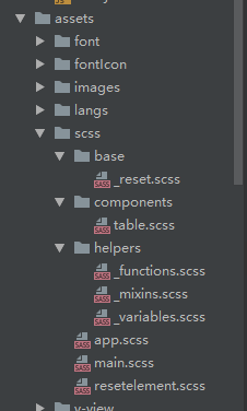
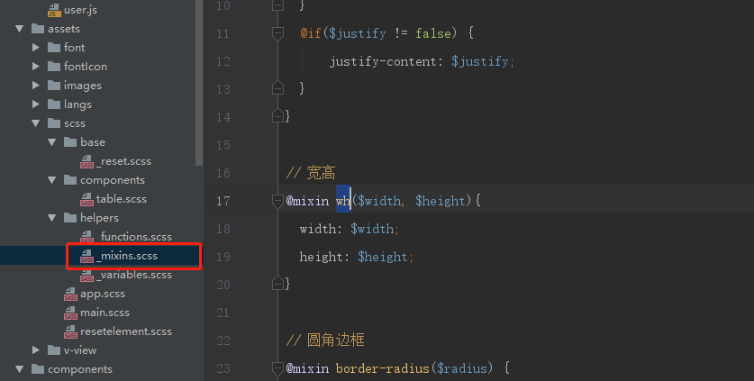
2、放入把我们的mixin方法
1
2
3
4
5
6
7
8
9
| // 宽高
@mixin wh($width, $height){
width: $width;
height: $height;
}
// 圆角边框
@mixin border-radius($radius) {
border-radius: $radius;
}
|
3、注册我们的mixin方法
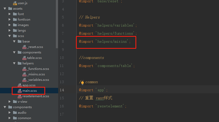
4、在vue.config.js中配置我们的css
1
2
3
4
5
6
7
8
9
| // css相关配置
css: {
// css预设器配置项
loaderOptions: {
sass: {
data: `@import '@assets/scss/main.scss';`
}
},
},
|
5、重启服务
6、页面上直接使用:
1
2
3
| #app{
@include wh(100%, 100%);
}
|
到页面上就是:
1
2
| width:100%;
height:100%;
|
四、vue2中样式scss的mixin用法
在vue2中我们使用scss的时候的一些方法挪移到vue3中,会出现一些问题,比如我们的配置文件都ok了,但是我们页面上使用@include wx() 会报错找不到这个mixin方法。
1、引入你的公共scss文件
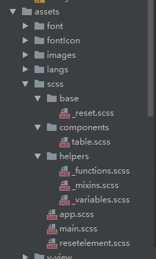
2、放入把我们的mixin方法
1
2
3
4
5
6
7
8
9
| // 宽高
@mixin wh($width, $height){
width: $width;
height: $height;
}
// 圆角边框
@mixin border-radius($radius) {
border-radius: $radius;
}
|

3、main.js注册我们的入口文件 main.scss,此外,不在main.scss里面注册mixin方法
1
| import '@/assets/scss/main.scss'
|
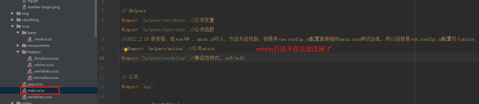
4、在vue.config.js中配置我们的mixin方法
1
2
3
4
5
6
7
8
9
|
css: {
loaderOptions: {
sass: {
prependData: `@import '@/assets/scss/helpers/_mixins.scss';`
}
},
},
|
5、重启服务
6、页面上直接使用:
1
2
3
| #app{
@include wh(100%, 100%);
}
|
到页面上就是:
1
2
| width:100%;
height:100%;
|
五、常用的scss mixin代码
1、溢出显示省略号
参数可以只是单/多行。
1
2
3
4
5
6
7
8
9
10
11
12
13
14
15
16
17
18
|
@mixin ellipsis($rowCount: 1) {
@if $rowCount <=1 {
overflow: hidden;
text-overflow: ellipsis;
white-space: nowrap;
} @else {
min-width: 0;
overflow: hidden;
text-overflow: ellipsis;
display: -webkit-box;
-webkit-line-clamp: $rowCount;
-webkit-box-orient: vertical;
}
}
|
2、真1px边框
移动端由于像素密度比的问题, 实际的1px边框看起来比较粗, 如果想要更”细”可以使用下面的代码. 不同像素密度比的设备都可以兼容(pc/手机), 还支持任意数量圆角.
1
2
3
4
5
6
7
8
9
10
11
12
13
14
15
16
17
18
19
20
21
22
23
24
25
26
27
28
29
30
31
32
33
34
35
36
37
38
39
40
41
42
43
44
45
46
47
48
49
50
51
52
53
54
55
56
57
58
59
60
61
62
63
64
65
66
67
68
69
70
71
72
73
74
75
76
77
78
79
80
81
82
83
84
85
86
87
88
89
90
91
92
93
94
95
96
|
@mixin thinBorder(
$directionMaps: bottom,
$color: #ccc,
$radius: (
0,
0,
0,
0
),
$position: after
) {
// 是否只有一个方向
$isOnlyOneDir: string==type-of($directionMaps);
@if ($isOnlyOneDir) {
$directionMaps: ($directionMaps);
}
@each $directionMap in $directionMaps {
border-#{$directionMap}: 1px solid $color;
}
// 判断圆角是list还是number
@if (list==type-of($radius)) {
border-radius: nth($radius, 1)
nth($radius, 2)
nth($radius, 3)
nth($radius, 4);
} @else {
border-radius: $radius;
}
@media only screen and (-webkit-min-device-pixel-ratio: 2) {
& {
position: relative;
// 删除1像素密度比下的边框
@each $directionMap in $directionMaps {
border-#{$directionMap}: none;
}
}
&:#{$position} {
content: "";
position: absolute;
top: 0;
left: 0;
display: block;
width: 200%;
height: 200%;
transform: scale(0.5);
box-sizing: border-box;
padding: 1px;
transform-origin: 0 0;
pointer-events: none;
border: 0 solid $color;
@each $directionMap in $directionMaps {
border-#{$directionMap}-width: 1px;
}
// 判断圆角是list还是number
@if (list==type-of($radius)) {
border-radius: nth($radius, 1) *
2
nth($radius, 2) *
2
nth($radius, 3) *
2
nth($radius, 4) *
2;
} @else {
border-radius: $radius * 2;
}
}
}
@media only screen and (-webkit-min-device-pixel-ratio: 3) {
&:#{$position} {
// 判断圆角是list还是number
@if (list==type-of($radius)) {
border-radius: nth($radius, 1) *
3
nth($radius, 2) *
3
nth($radius, 3) *
3
nth($radius, 4) *
3;
} @else {
border-radius: $radius * 3;
}
width: 300%;
height: 300%;
transform: scale(0.3333);
}
}
}
|
3、等边三角形
常用来做下拉菜单的方向指示, 如果你做的页面就是个简单的活动页, 引入”饿了么”一类的ui就有些大材小用了, 借助”三角形”你可以自己做一个简单的.
1
2
3
4
5
6
7
8
9
10
11
12
13
14
15
16
17
18
19
20
21
22
23
24
|
@mixin triangle($size: 5px, $color: rgba(0, 0, 0, 0.6), $dir: bottom) {
width: 0;
height: 0;
border-style: solid;
@if (bottom==$dir) {
border-width: $size $size 0 $size;
border-color: $color transparent transparent transparent;
} @else if (top==$dir) {
border-width: 0 $size $size $size;
border-color: transparent transparent $color transparent;
} @else if (right==$dir) {
border-width: $size 0 $size $size;
border-color: transparent transparent transparent $color;
} @else if (left==$dir) {
border-width: $size $size $size 0;
border-color: transparent $color transparent transparent;
}
}
|
4、loading
这是一个”半圆边框”旋转的loading, 你可以根据业务需求自己指定圆的半径.
1
2
3
4
5
6
7
8
9
10
11
| @mixin loading-half-circle($width: 1em) {
display: inline-block;
height: $width;
width: $width;
border-radius: $width;
border-style: solid;
border-width: $width/10;
border-color: transparent currentColor transparent transparent;
animation: rotate 0.6s linear infinite;
vertical-align: middle;
}
|
5、水平垂直居中
1
2
3
4
5
6
7
8
9
10
11
12
13
14
15
16
17
18
19
20
21
22
23
24
25
26
| // 水平竖直方向居中-translate
@mixin center {
position: absolute;
left: 50%;
top: 50%;
-moz-transform: translate(-50%, -50%);
-ms-transform: translate(-50%, -50%);
-o-transform: translate(-50%, -50%);
transform: translate(-50%, -50%);
}
// 水平竖直方向居中-flex
@mixin flex-center($w, $h) {
@include flex;
align-items: center;
justify-content: center;
}
//水平竖直方向居中-margin
@mixin know-center($w, $h) {
position: absolute;
left: 50%;
top: 50%;
margin-left: -($w/2);
margin-top: -($h/2);
}
|
6、清除浮动
1
2
3
4
5
6
7
8
9
10
| @mixin clearfix {
*zoom: 1;
&:after {
content: "";
display: block;
height: 0;
visibility: hidden;
clear: both;
}
}
|
7、图片的处理
1
2
3
4
5
6
7
8
9
10
11
12
13
14
15
16
17
18
19
| // 滤镜: 将彩色照片显示为黑白照片、保留图片层次
@mixin grayscale {
-webkit-filter: grayscale(100%);
-moz-filter: grayscale(100%);
-ms-filter: grayscale(100%);
-o-filter: grayscale(100%);
filter: grayscale(100%);
}
// 模糊 毛玻璃效果
@mixin blur($blur: 10px) {
-webkit-filter: blur($blur);
-moz-filter: blur($blur);
-o-filter: blur($blur);
-ms-filter: blur($blur);
filter: progid:DXImageTransform.Microsoft.Blur(PixelRadius='${blur}');
filter: blur($blur);
*zoom: 1;
}
|
六、总结
以上内容均为整理及实践总结而来,可能不是最优解,如果你又更好的想法,欢迎与我交流~ 用好 mixin 或许可以让你省去大量重复性工作,空出大把时间,为升职加薪迎娶白富美走上人生巅峰做梦去吧。