CSS3动画条纹边框
先简单的说一下实现原理,大家都可以通过demo看到最终的效果,当鼠标停留在图片上面时,图片的边框就会出现带有斜度的条纹背景(暂且不管动画), 看下源代码就能明白其中的原理,首先用样式制作出条纹背景,设置opacity值为0,在鼠标经过图片所在的层是再将opacity改为1并且中间设置个过渡时间,这样子条纹背景图就能缓慢的出现以及消失,这个原理是比较简单的。下面就为大家介绍下CSS3动画条纹边框的制作以及代码的编写。
HTML结构
首先是HTML结构的编写,仔细分析一下demo的效果,结构应该是比较简单的,只需要两层元素即可。其实我们可以利用《 CSS伪元素before、after妙用:制作时尚焦点图相框》一文中的伪元素::before来处理条纹背景,但考虑浏览器兼容性原因以及这一次想换个方式来输出实现,只要额外添加一个<div>即可。例如:
1 | <div class="product-hover"></div> |
如果结构是这样子编写的话,那条纹背景将是一个层,而图片也是一个层,所以要注意的是,条纹形状不是图片的边框, 而是另外一个层的显示效果,只是叠加到了图片下面,所以看起来像是图片的边框。
在本例中的HTML具体代码如下:
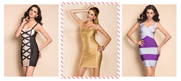
1 | <div class="main"> |
定义CSS样式
接下来我们一起来看看怎么定义样式。在一个盒模型里面,我们需要预留padding: 15px;,用来作为显示条纹形式的区域。
1 | .product { |
然后是条纹形状的制作以及动画的实现:
1 | .product-hover { |
最后是鼠标经过图片是,显示条纹形状:
1 | .product:hover .product-hover, .product:active .product-hover { |
其主要的代码就是这些了,如果要查看完整的css代码,可下载附件查阅。