手机页面设计一般的大小是640,但是,手机屏幕大小确实不确定的,这样,怎么才能做出适应所有手机的手机页面呢?
一般的解决方案有两种,rem布局和百分比布局。这两种方案我有都试过,所以现在更推荐用rem布局来制作手机页面;
rem布局的兼容性:
Mozilla Firefox 3.6+、Apple Safari 5+、Google Chrome、IE9+和Opera11+、ie6-ie8 还是别用rem
不过现在的手机一般浏览器,一般可以直接不用去管IE内核的浏览器了。
REM的计算公式
例:html 设置font-size:16px 1rem = 16px
那么640px = 640/16 =40rem
个人建议设置为100px 方便计算
首先,给页面的html定义一个100px的
html{ font-size:100px;}/设定基础rem/
然后,最核心的代码就是这一段js运算了,根据页面的大小来控制基础rem的值;
1
2
3
4
5
6
7
8
9
10
11
| new function (){
var _self = this;
_self.width = 640;
_self.fontSize = 100;
_self.widthProportion = function(){var p = (document.body&&document.body.clientWidth||document.getElementsByTagName("html")[0].offsetWidth)/_self.width;return p>1?1:p<0.5?0.5:p;};
_self.changePage = function(){
document.getElementsByTagName("html")[0].setAttribute("style","font-size:"+_self.widthProportion()*_self.fontSize+"px !important");
}
_self.changePage();
window.addEventListener('resize',function(){_self.changePage();},false);
};
|
demo
完整代码:
1
2
3
4
5
6
7
8
9
10
11
12
13
14
15
16
17
18
19
20
21
22
23
24
25
26
27
28
29
30
31
32
33
34
35
36
37
38
39
40
41
42
43
44
45
46
47
48
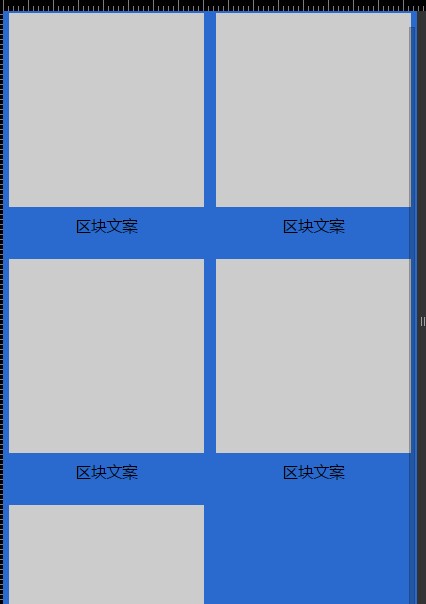
| <!DOCTYPE html>
<html>
<head>
<meta name="viewport" content="width=device-width, initial-scale=1.0, user-scalable=0, minimum-scale=1.0, maximum-scale=1.0">
<meta charset="utf-8">
<title>rem基础布局</title>
<script type="text/javascript">
new function (){
var _self = this;
_self.width = 640;
_self.fontSize = 100;
_self.widthProportion = function(){var p = (document.body&&document.body.clientWidth||document.getElementsByTagName("html")[0].offsetWidth)/_self.width;return p>1?1:p<0.5?0.5:p;};
_self.changePage = function(){
document.getElementsByTagName("html")[0].setAttribute("style","font-size:"+_self.widthProportion()*_self.fontSize+"px !important");
}
_self.changePage();
window.addEventListener('resize',function(){_self.changePage();},false);
};
</script>
<style type="text/css">
*{margin: 0px; padding: 0px;}
ul{list-style: none;}
.wrap{min-width: 320px; max-width: 640px; width: 100%; margin: 0px auto;; background: #2a6ace; font-family:'微软雅黑', 'helvetica neue',tahoma,'hiragino sans gb',stheiti,'wenquanyi micro hei',\5FAE\8F6F\96C5\9ED1,\5B8B\4F53,sans-serif; font-size: 12px;}
.pro{width:6.2rem; margin: 0px auto; padding-top: 20px; overflow: hidden;}
.clearfix:after {content:"";height:0;display:block;clear:both;}
.clearfix {zoom:1;}
.pro ul{width:6.4rem;}
.pro li{width: 3rem; height: 3.6rem; float: left; margin: 0 0.2rem 0.2rem 0;}
.pro li .box{width: 3rem; height: 3rem; background: #ccc;}
.pro li p{font-size: 0.24rem; line-height: 0.6rem; text-align: center;}
</style>
</head>
<body>
<div class="wrap">
<div class="pro">
<ul class="clearfix">
<li> <div class="box"></div> <p>区块文案</p> </li>
<li> <div class="box"></div> <p>区块文案</p> </li>
<li> <div class="box"></div> <p>区块文案</p> </li>
<li> <div class="box"></div> <p>区块文案</p> </li>
<li> <div class="box"></div> <p>区块文案</p> </li>
</ul>
</div>
</div>
</body>
</html>
|